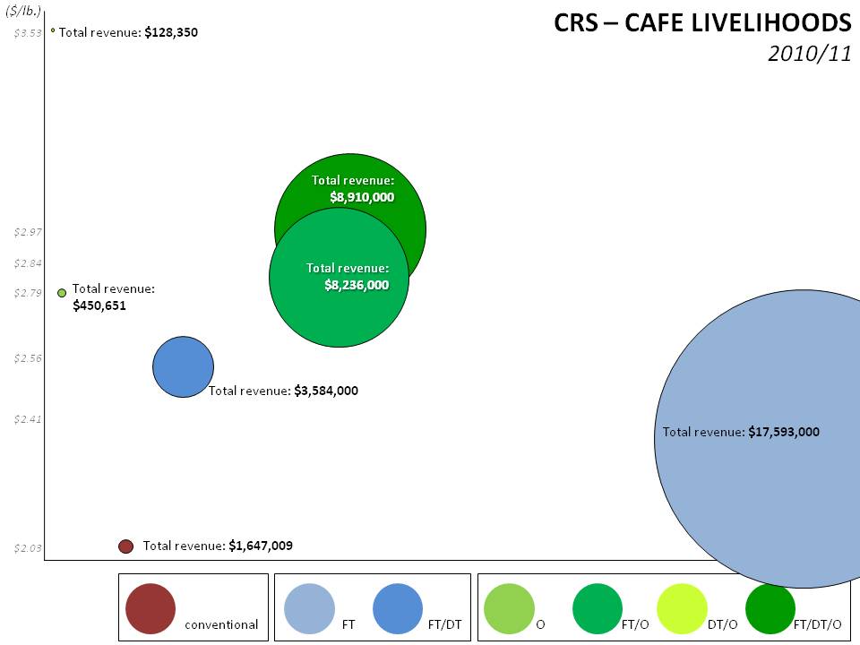
Last week I posted some final sales data from our recently concluded CAFE Livelihoods project. It provoked some thoughtful comments and rich discussion, most of which centered around the flaws in the presentation of the data. I look forward to revisiting the issue of assessing impact at origin in the New Year. In the meantime, and without getting into the finer points of random sampling or other statistical minutiae, I just want to suggest that even presenting the same data I did last week in a different way — privileging total revenue over price per pound — creates a very different visual impression in terms of impact at origin.
Whether you prefer the planetary presentation of the data above or the block graph below, the point remains the same: data can be made to look very different with only subtle changes in emphasis.
Last week’s infographics — with all their flaws — showed that coffee sold through Direct Trade channels netted higher prices across the board than coffee traded through less direct channels. The suggestion was that the developmental impact of Direct Trade is greater than the developmental impact of less direct trade.
But today, the same data are presented privileging total revenue over price per pound, and it tells a very different story. Collectively, the less direct channels put more money in the pockets of farmers than Direct Trade channels because the volumes were so much greater. Volume also has a positive developmental impact — when farmers and cooperatives can count on moving a good chunk of their production to market each year through reliable trading channels (even at lower prices), it creates income stability and reduces risk to farmers, cooperatives and lenders.
More in the New Year on assessing impact at origin.


